
Demon Dynamo
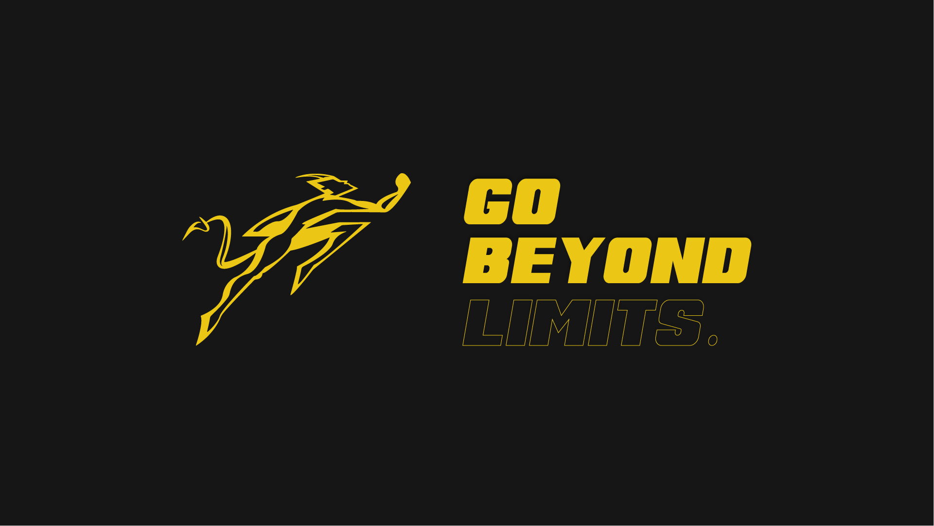
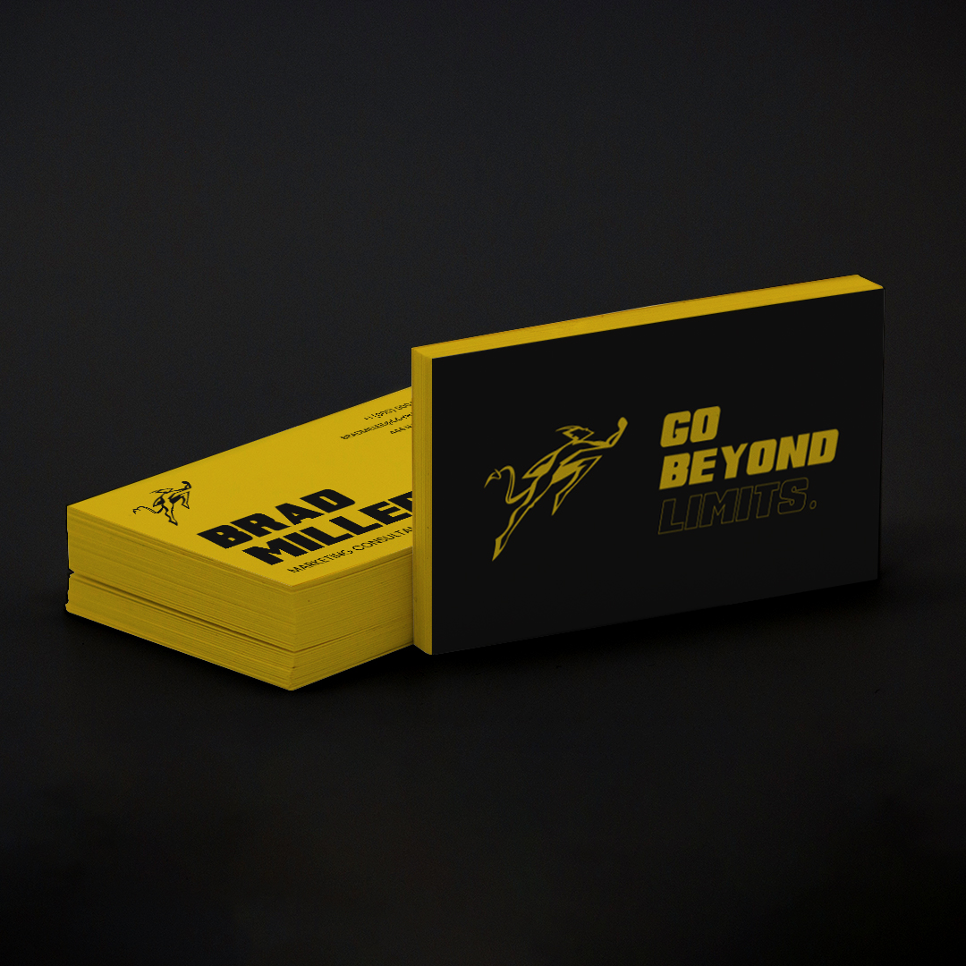
Go Beyond Limits
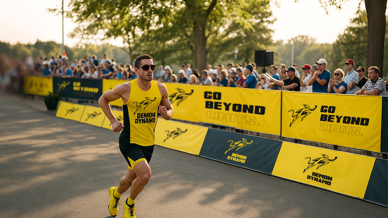
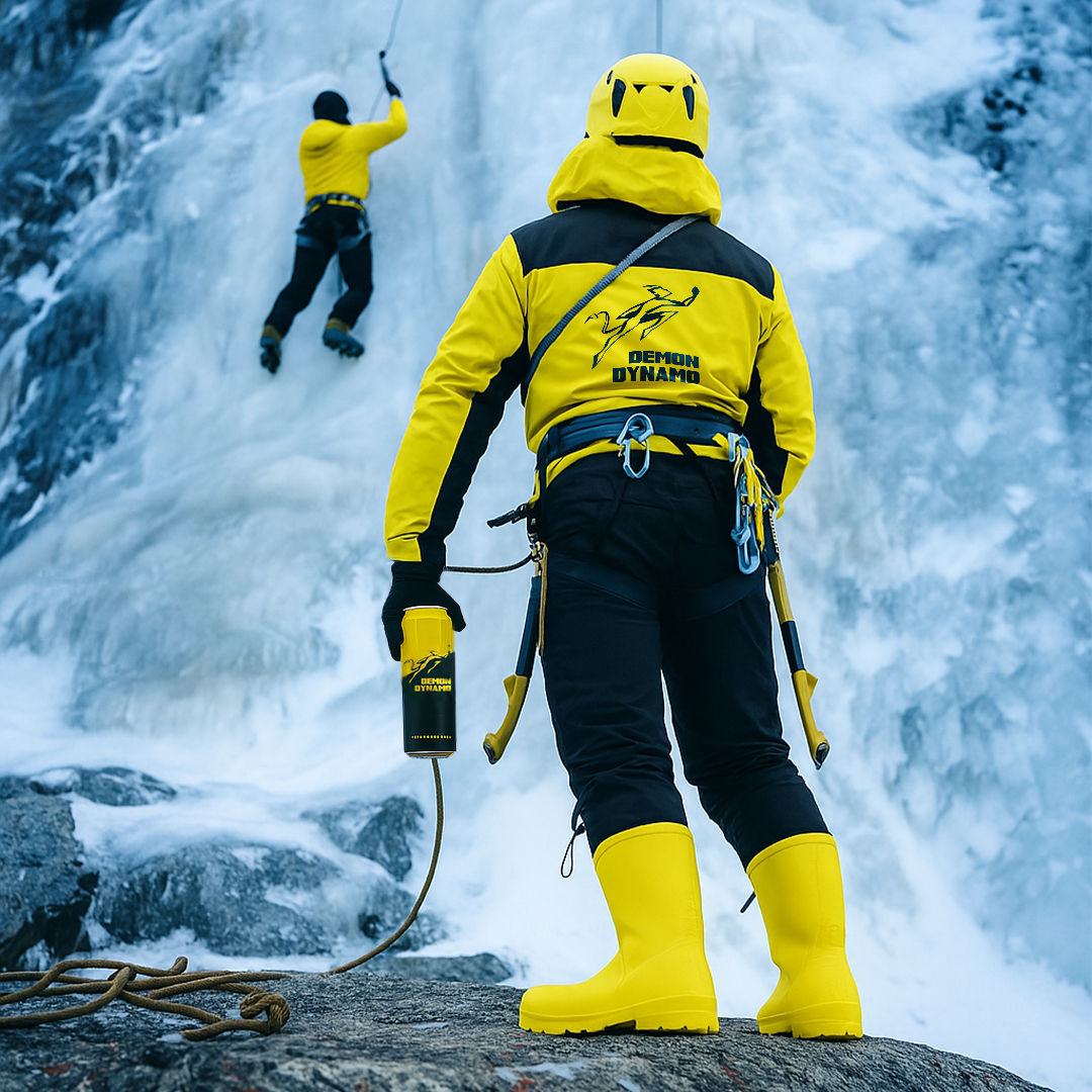
In a market flooded with options for casual consumers, Demon Dynamo is for those who operate at the edge-ultrarunners, climbers, ER nurses, and adrenaline junkies who laugh at limits.
Demon dynamo is not just an energy drink; it’s a rapid-fire fuel with clean ingredients, crafted for the 1% who demand more. More than an energy drink, they are a brand that describe themselves as a tribe united by rebellion and the pursuit of greatness. Our mantra? “Go beyond the limits.”
Demon dynamo is not just an energy drink; it’s a rapid-fire fuel with clean ingredients, crafted for the 1% who demand more. More than an energy drink, they are a brand that describe themselves as a tribe united by rebellion and the pursuit of greatness. Our mantra? “Go beyond the limits.”
SERCVICES PROVIDED
Brand StrategyVisual IdentityVerbal IdentityPackage Design
Go Beyond Limits
SERCVICES PROVIDED
Brand StrategyVisual IdentityVerbal IdentityPackage Design
In a market flooded with options for casual consumers, Demon Dynamo is for those who operate at the edge-ultrarunners, climbers, ER nurses, and adrenaline junkies who laugh at limits.
Demon dynamo is not just an energy drink; it’s a rapid-fire fuel with clean ingredients, crafted for the 1% who demand more. More than an energy drink, they are a brand that describe themselves as a tribe united by rebellion and the pursuit of greatness. Our mantra? “Go beyond the limits.”
Demon dynamo is not just an energy drink; it’s a rapid-fire fuel with clean ingredients, crafted for the 1% who demand more. More than an energy drink, they are a brand that describe themselves as a tribe united by rebellion and the pursuit of greatness. Our mantra? “Go beyond the limits.”
BRAND STRATEGY
Demon Dynamo’s strategy is simple: own the premium energy space by fueling extreme performers: athletes, adventurers, and driven pros who push human limits every day.
The brand runs on three pillars: speed, purity, and niche mastery. Instead of chasing the masses, Demon Dynamo backs the top 1% of people who treat fitness and performance like a calling.
This laser focus builds a tight-knit community built on the belief that “Demons Don’t Run Alone,” with products and messaging that match their relentless pace and zero-compromise mindset.
At its core, Demon Dynamo channels the Outlaw: rebelling against the ordinary with raw visuals and rally cries like “Go Beyond Limits.” But this rebellion isn’t empty noise. It’s fused with the Hero’s drive to push further and fuel the relentless pursuit of better.
This blend hooks people on two levels: the Outlaw draws in rebels hungry for realness, while the Hero lifts them higher; turning each can into a catalyst for transformation. By balancing disruption with purpose, Demon Dynamo isn’t just another energy drink; it’s a badge for those who break rules and live bigger.
This blend hooks people on two levels: the Outlaw draws in rebels hungry for realness, while the Hero lifts them higher; turning each can into a catalyst for transformation. By balancing disruption with purpose, Demon Dynamo isn’t just another energy drink; it’s a badge for those who break rules and live bigger.
VERBAL IDENTITY
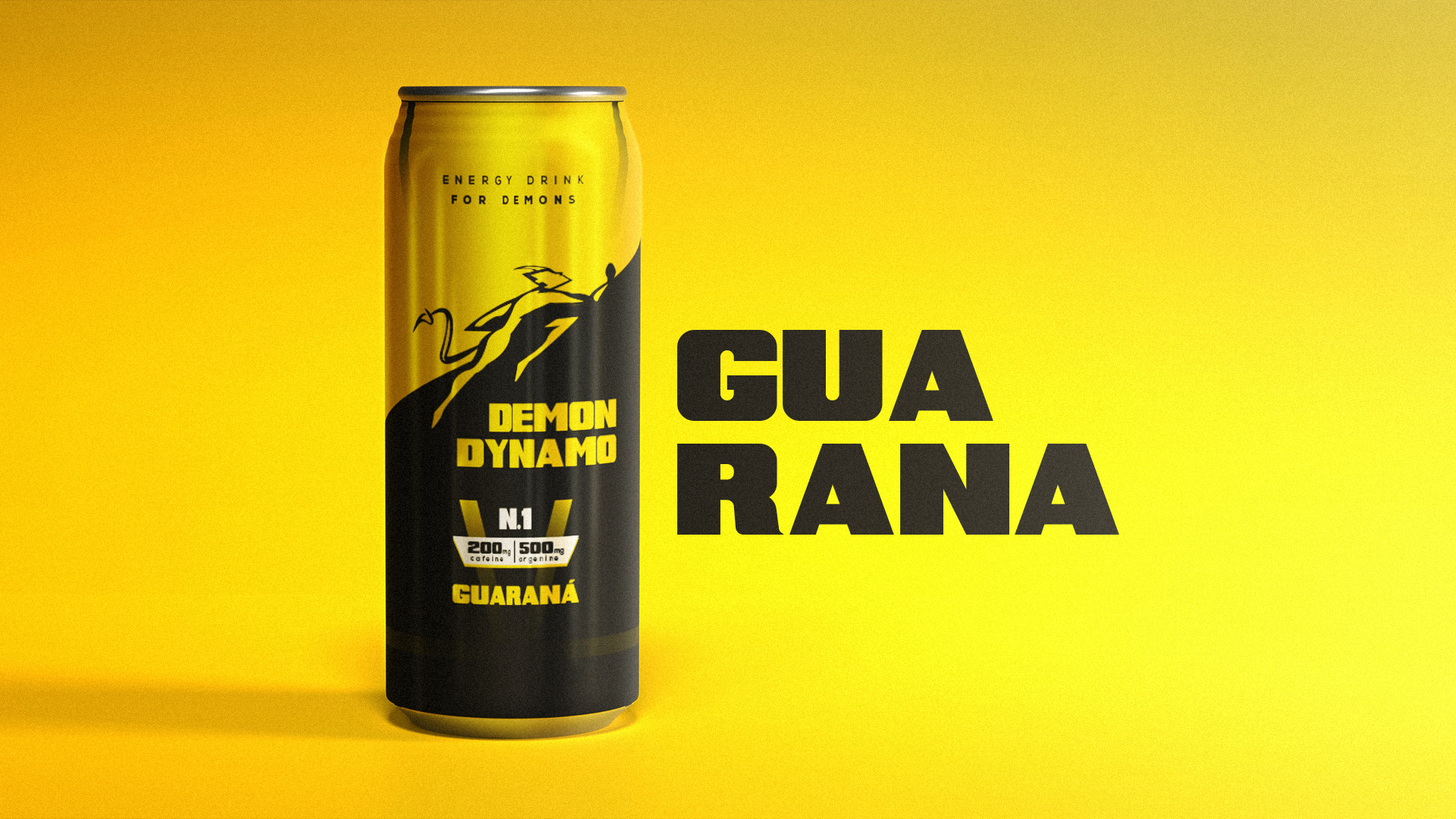
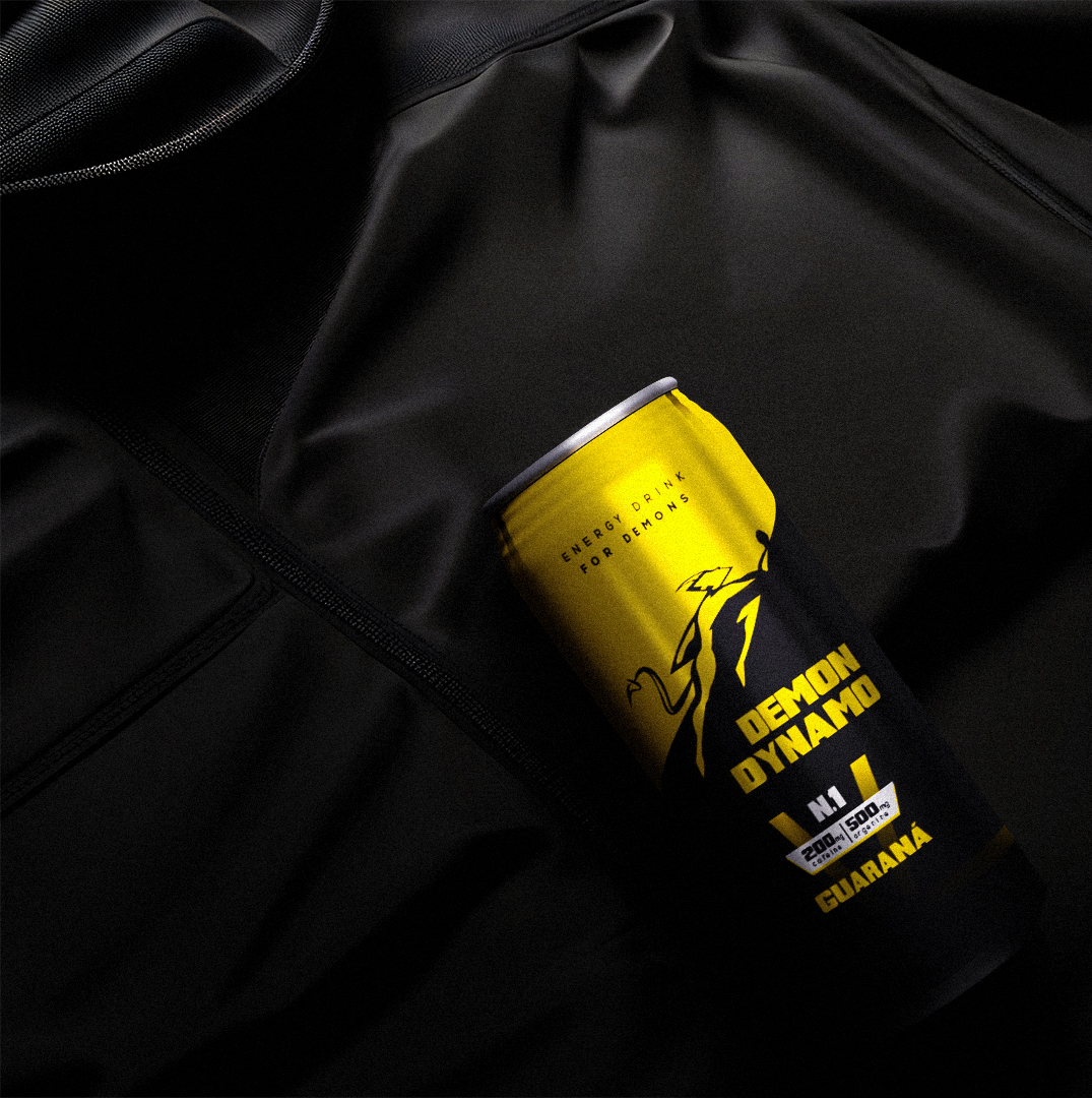
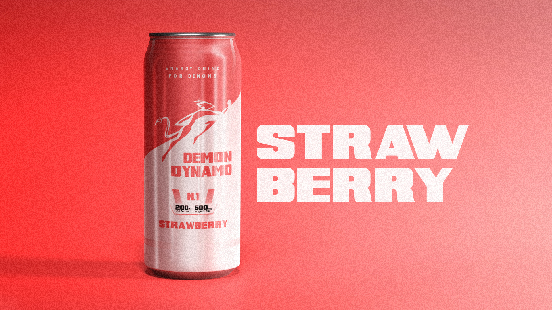
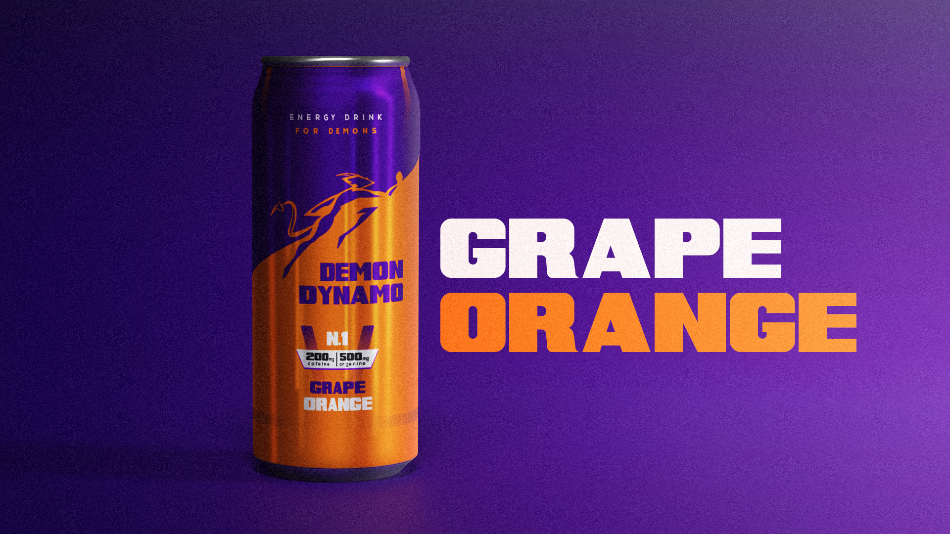
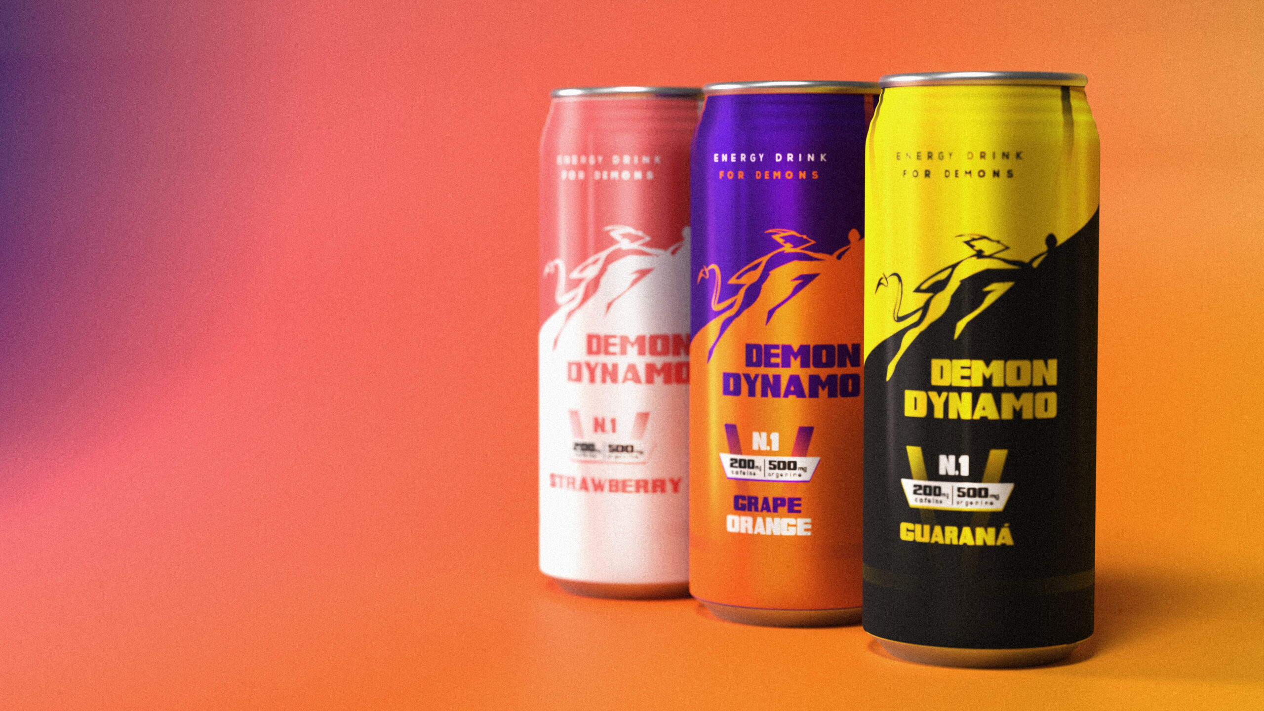
Demon Dynamo’s core promise is simple: fast, clean energy to your body in under three minutes; no crashes, no fake shortcuts that wreck your body. The lineup comes in three bold flavors: Guarana, Strawberry, and Grape/Orange. Quality is non-negotiable: no gimmicks, just real fuel for outperformers.
The brand sits at the edge of performance and extreme sports situations where your body demands you to push harder , with a clean angle that gets you within the fitness world for those who want power without the crash.
The brand sits at the edge of performance and extreme sports situations where your body demands you to push harder , with a clean angle that gets you within the fitness world for those who want power without the crash.
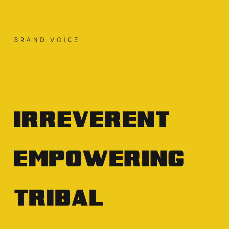
The tone is bold and commanding, but always fuels you forward; like a coach who pushes you to your limit, then shouts your name when you win. Every line rejects corporate filler. Every word hits like a spark. Gritty humor keeps it real, social slangs keeps it human.
On social, it’s punchy and friendly; fuel for rebels who share the vibe. In ads, it goes cinematic and raw, pulling you straight into the moment you need that kick.
On social, it’s punchy and friendly; fuel for rebels who share the vibe. In ads, it goes cinematic and raw, pulling you straight into the moment you need that kick.
VISUAL IDENTITY
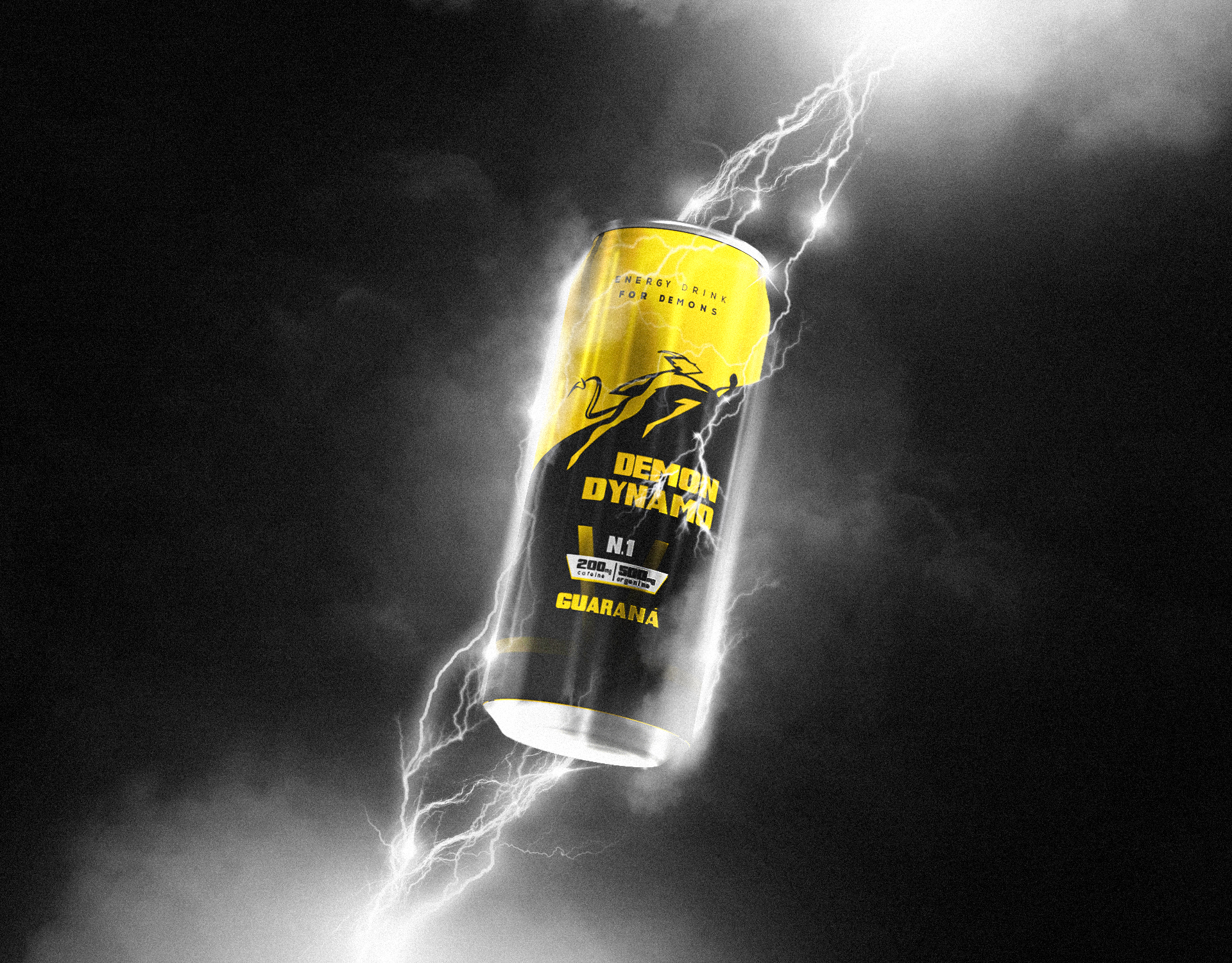
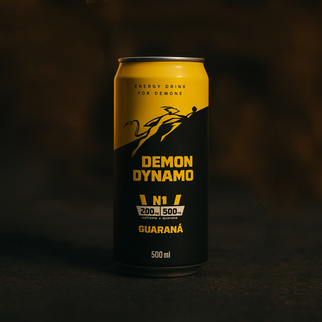
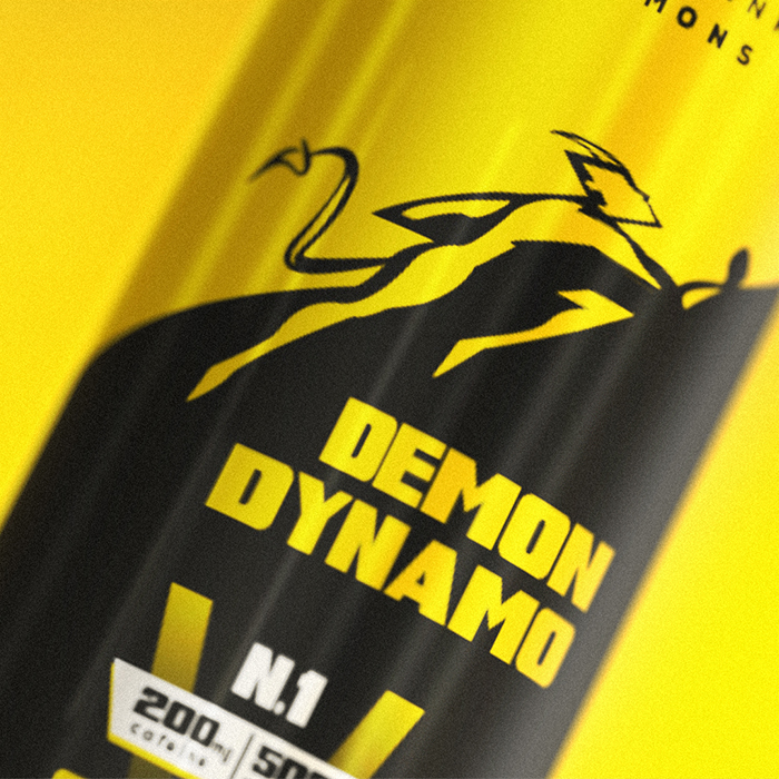
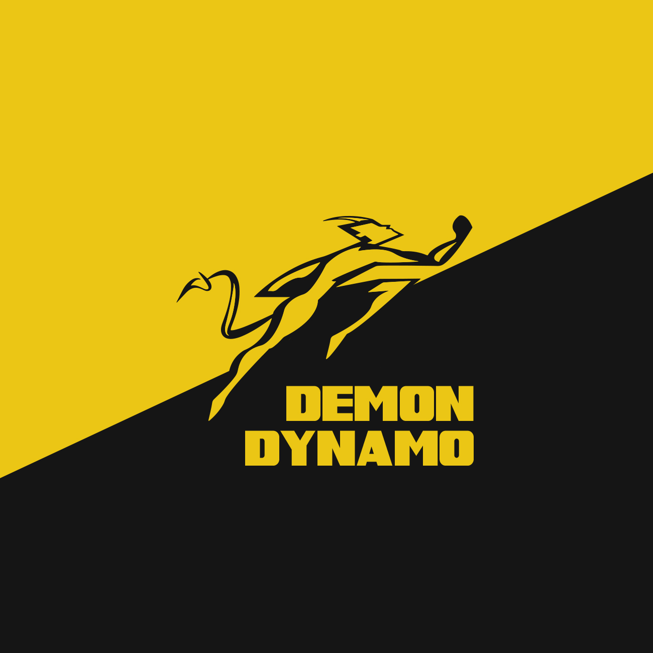
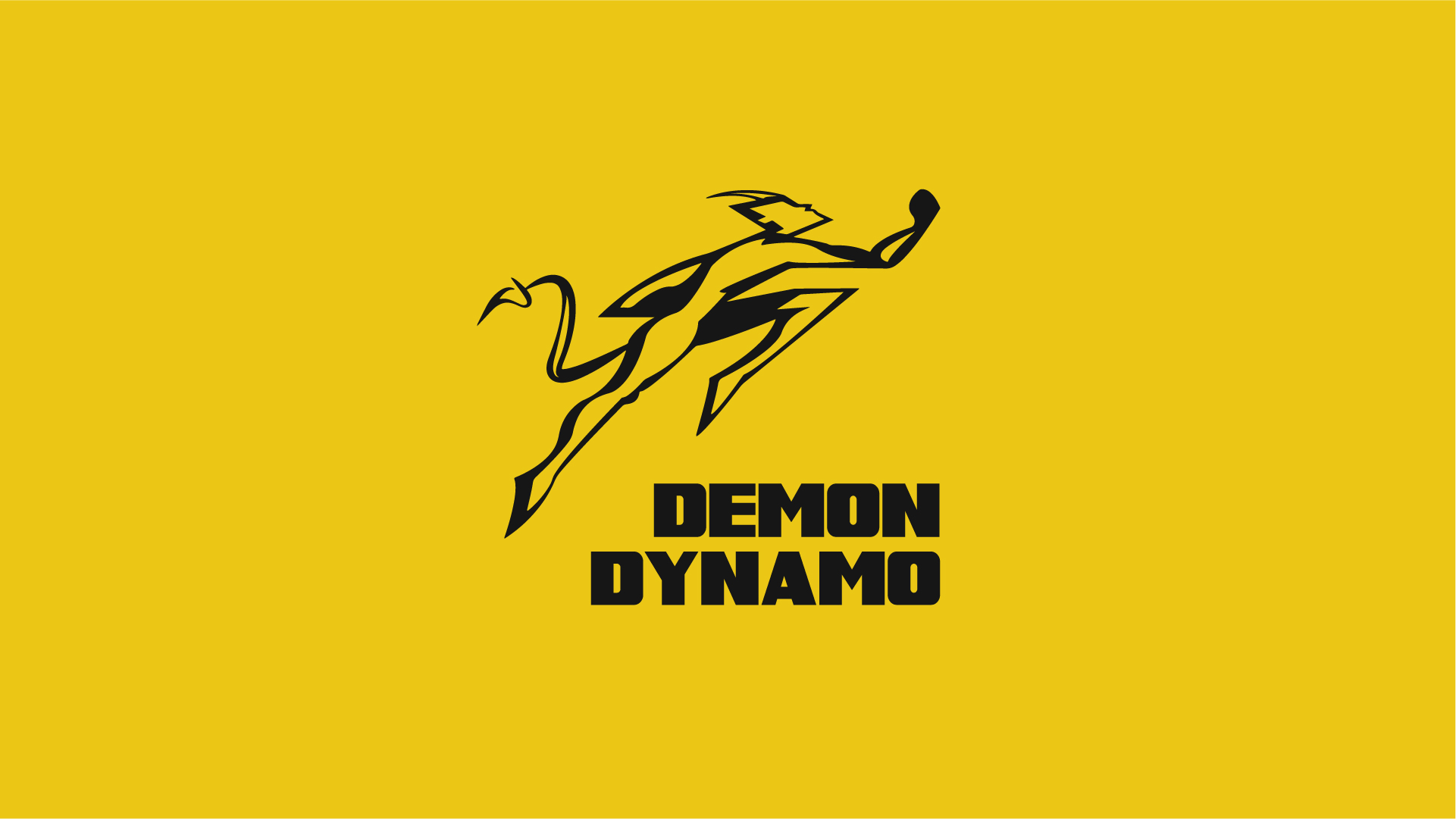
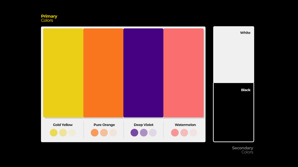
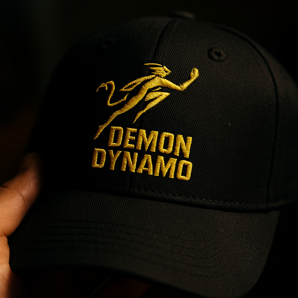
Demon Dynamo’s packaging screams defiance and raw energy. The black and yellow palette signals power and hazard which is perfect for a brand that dares you to push harder. Bold type and striking shots of climbers, ultrarunners, and thrill-chasers bring the action front and center.
The rough texture adds grit in your hand, we wanted to reflect is built for people who live without fear or regret. Yellow and black stay core, but each flavor drops in its own punch of color, keeping the lineup vibrant but unmistakably Dynamo.
The rough texture adds grit in your hand, we wanted to reflect is built for people who live without fear or regret. Yellow and black stay core, but each flavor drops in its own punch of color, keeping the lineup vibrant but unmistakably Dynamo.
Wowness and punch sit at the core of our packaging. Anyone picking up a Demon Dynamo knows exactly what they’re getting: high performance, zero fluff.
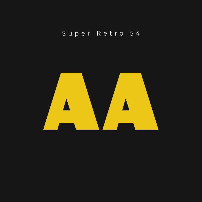
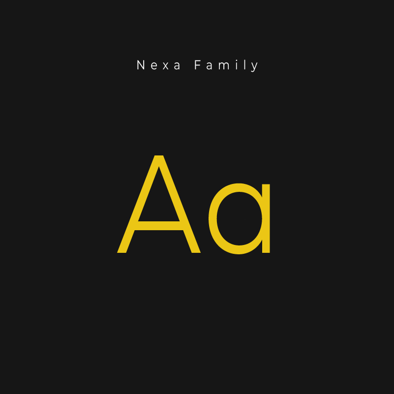
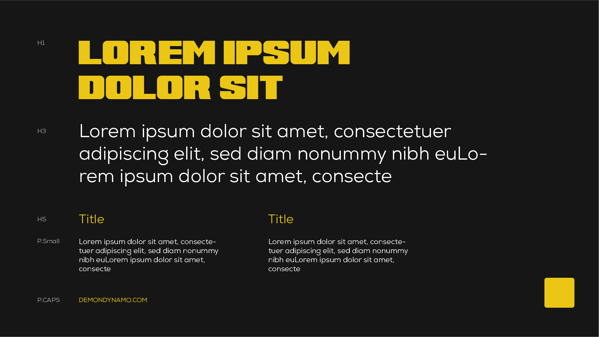
In the typo section, Nexa does the heavy lifting: a clean, modern typeface that’s bold but easy to read at any angle; and to amp up the attitude, we pair it with Super Retro M54 (as secondary option) which is a sporty, clean, and built to energize. Together, they keep every can unmistakable: clear, strong, and ready to move.
In the typo section, Nexa does the heavy lifting: a clean, modern typeface that’s bold but easy to read at any angle; and to amp up the attitude, we pair it with Super Retro M54 (as secondary option) which is a sporty, clean, and built to energize. Together, they keep every can unmistakable: clear, strong, and ready to move.
NEXT CASE STUDY
Stage
We’re interested in hearing your brand story and the challenges
you face everyday. No strings attached, just a
friendly conversation to help you take the next step forward.